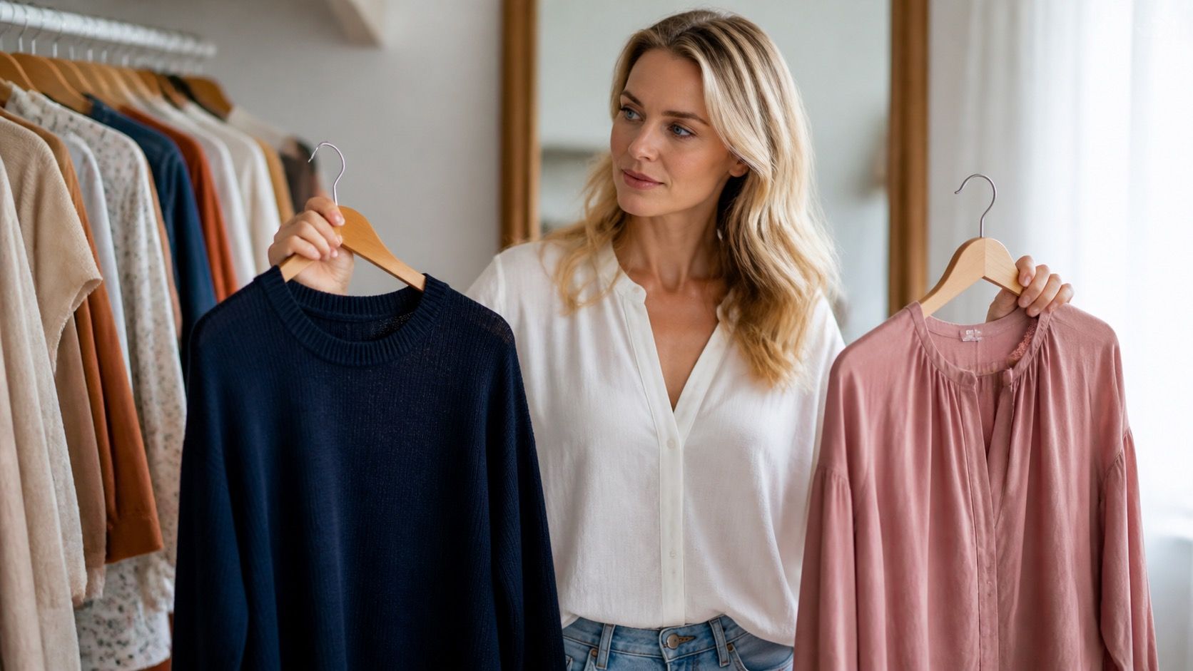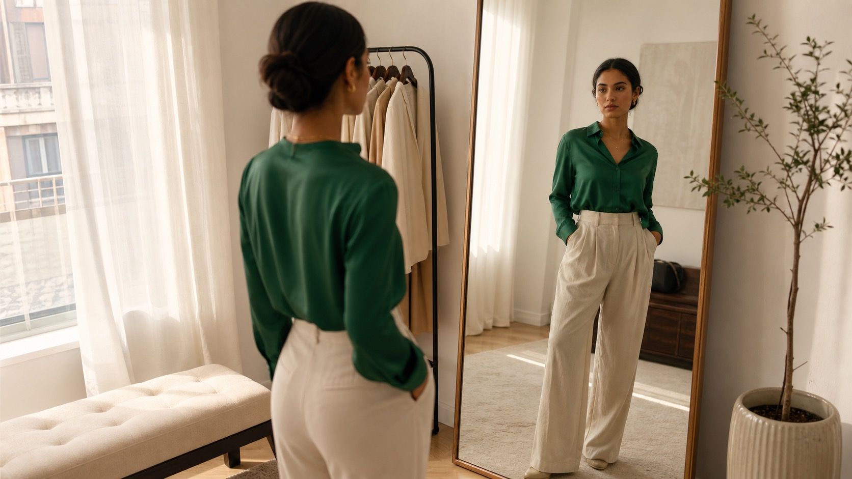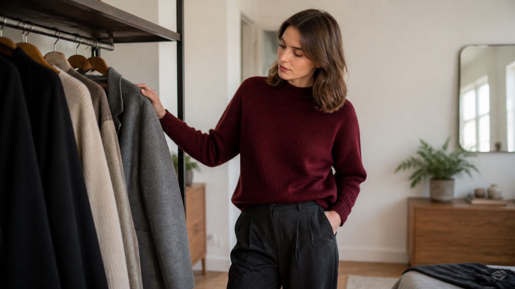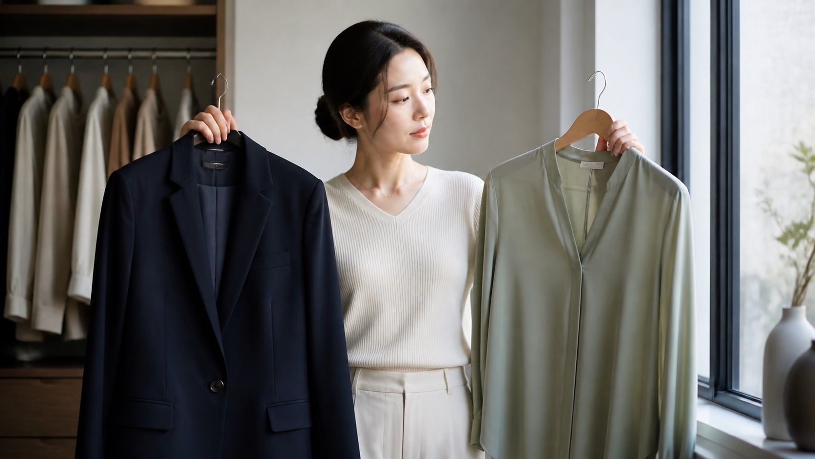
Searching for the best clothing colors for Asian skin tone can produce very confident answers built on a very broad label. That is the problem. Asian people have many different skin depths, undertones, hair colors, and levels of natural contrast. A color choice gets more useful when you stop asking what an ethnic category should wear and start checking what happens to your own face beside navy, cream, olive, berry, and the shades already hanging in your closet.
A broad label cannot choose a personal palette
Two people with black hair may look completely different in the same mustard top. One may have cool, pinkish skin and find mustard makes the complexion look sallow. Another may have a golden or olive undertone and find it warm and easy. Regional background does not settle this question, and neither does a single wrist-vein test. Veins can look blue, green, or hard to read depending on lighting and skin depth.
Use a small comparison instead. Near a window, hold a clean white fabric, a cream fabric, a medium cool grey, and a warm camel or olive near your jaw. Do this without a beauty filter, and ideally without base makeup. Notice which color makes unevenness more obvious and which one lets the eyes and mouth stay clear. You are not trying to prove a permanent category. You are collecting a practical clue for choosing shirts, knitwear, and coats.
Read undertone and contrast as two separate decisions
Undertone describes the underlying cast that remains beneath surface redness or a tan. Cool undertones often respond well to blue-based reds, cobalt, fuchsia, cool emerald, and blue-grey. Warm undertones may find coral, tomato red, marigold, warm olive, and creamy ivory easier to wear. Olive undertones can look good in colors from both groups, but often need to avoid shades that are too yellowed or too greyed out. The right test is visual, not theoretical.
Contrast is about the difference between your skin, hair, eyes, and the clothing. Dark hair can create strong natural contrast, so a black-and-white outfit may look clear and intentional. It can also dominate someone with softer features, especially when the top is a high black crew neck. In that case, ink navy, charcoal, espresso, or deep teal creates a similar outline with less severity. A lower neckline or a light collar can soften black without removing it from the wardrobe.
| If this happens in daylight | Test this next | What to watch for |
|---|---|---|
| Warm beige makes the face look yellow | Soft white, dove grey, navy, raspberry | Whether the under-eye area looks calmer |
| Icy pastels make skin look flat | Dusty rose, eucalyptus, muted coral, denim blue | A color that still reads clearly beside white |
| Black feels too sharp near the face | Ink navy, charcoal, plum, dark forest green | Definition without emphasizing shadows |
| Muted colors disappear against dark hair | Cobalt, berry, emerald, saturated coral | Whether you see the face before the garment |
Test color families outside the fitting-room mirror
Retail lighting is notorious for making warm shades look friendlier and cool shades look dull. Try a top by a north-facing window or step outside on an overcast day, when the light is neutral enough to show what the fabric is really doing. Navy is a useful benchmark because it comes in many versions. A blue-black navy can look almost as hard as black; a softer, slightly grey navy may be much easier. Photograph both if you are unsure.
For a cool direction, test berry, cobalt, blue-red, cool pink, and blue-green. For a warm direction, compare rust, coral, marigold, moss, and warm turquoise. If your skin is olive, try deep teal, aubergine, dusty rose, and true red as well; these often avoid the too-yellow versus too-blue trap. Make one change at a time. A colored top, bright lipstick, and a warm filter all at once will tell you nothing useful about the top.
Use dark hair as a styling tool, not a rule
Black or very dark brown hair often makes a high-contrast outfit easy to carry, but it does not require one. If you enjoy graphic dressing, a white shirt with black trousers or a black knit with cream jeans may echo the natural line of your hair. If the result feels stark, choose a middle value such as medium denim, sage, burgundy, or mushroom. The outfit still has structure, but it does not divide the body into hard blocks.
Hair color also changes the scale of a print. A tiny, low-contrast floral can get lost against very dark hair and a dark coat; a print with one clear color repeated in the outfit tends to look calmer. This does not mean avoiding soft colors. A pale blue blouse can work beautifully under a navy jacket, where the jacket supplies the depth the blouse lacks on its own.
Start a neutral wardrobe with colors that have a point of view
Neutral does not have to mean beige. Navy, charcoal, espresso, deep olive, cream, stone, and soft white can all form a useful base, but they do different things near the face. Try navy when black feels too severe. Choose espresso or chocolate when charcoal makes your complexion look cool and tired. If cream reads warmer and more relaxed than bright white, use it for shirts and knitwear; reserve the sharp white for a layer under a jacket or for trousers.
It helps to keep two neutrals rather than declaring one universal winner. For example, navy plus cream works with cobalt, coral, and berry. Espresso plus soft white works with rust, olive, and warm pink. This gives you a stable background for color without turning every purchase into a palette puzzle. A coat, trouser, and bag in related dark neutrals will earn more wear than five nearly identical black items.
Use photos and mirrors as evidence, with a little skepticism
Mirrors show movement and distance; phone photos show proportion and contrast. Both can mislead. A bathroom mirror with yellow bulbs may convince you that camel is perfect, while a phone camera may flatten a subtle lavender. Use both, but keep the conditions simple: same window, same time of day, same camera exposure, and no portrait retouching. Take a front photo and one from a few steps back, because a color that works close up can look different in a full outfit.
Do not judge a shade by whether it makes skin look lighter, darker, or artificially flawless. A good clothing color makes the face look present and balanced. It lets natural warmth, coolness, freckles, or variation remain visible without pulling attention toward shadows or unevenness. That is a much healthier and more reliable target.
Turn the tests into ordinary outfits
Once you have two or three colors that work near your face, repeat them in simple formulas. A navy blazer over a berry tee and jeans is easy for work or travel. A cream sweater with dark teal trousers gives a softer contrast. A rust shirt can sit well with dark denim if it flatters your undertone, while a cobalt knit can carry an otherwise neutral outfit on its own. Keep one part of the outfit quiet when another part has strong color.
Build slowly. Start with the tops you wear most and check them in your normal morning light, not only on a shopping day when everything feels new. Clothing colors for Asian skin tone become less mysterious when they are treated as a personal observation problem. Undertone, hair contrast, and daylight give you better answers than a label ever will.