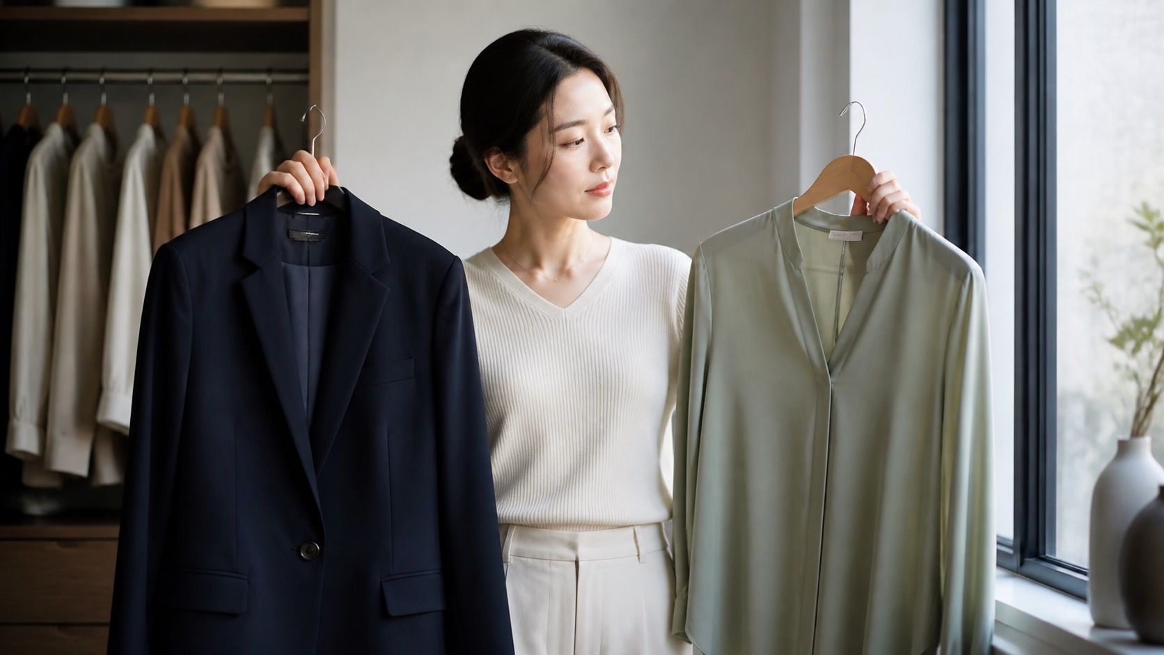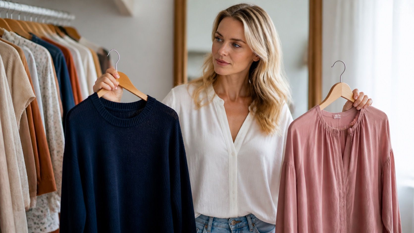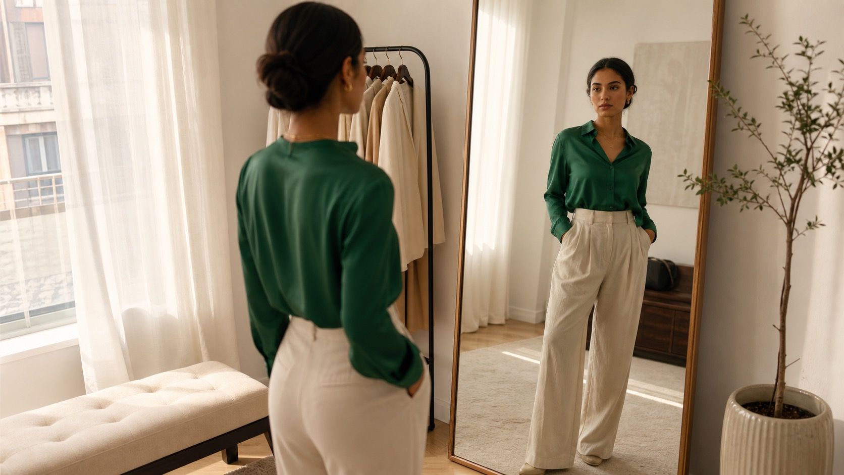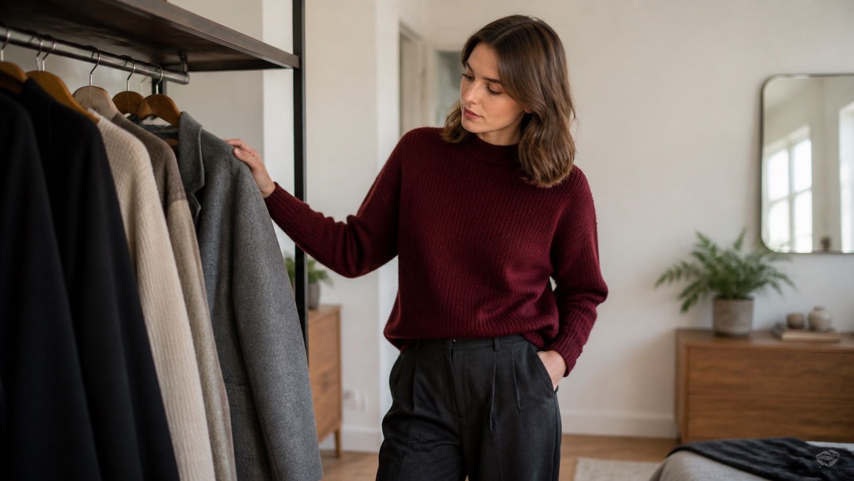
The best clothing colors for pale skin are rarely a short list of approved shades. The useful question is whether a color gives your face enough definition without making it look grey, pink, or swallowed by the garment. A navy sweater can be perfect on one fair-skinned person and severe on another. The difference usually comes down to undertone, hair contrast, and the light you see yourself in every day.
Start with the version of pale skin you actually have
Fair skin is often discussed as though it comes with one built-in palette. It does not. Some people have a cool, rosy cast; some look peach or golden; others sit somewhere olive-leaning and find that both icy pink and camel look strangely off. Before buying anything, stand by a window without makeup and hold a soft white T-shirt, a cream one, and a medium grey one near your face. Soft white often makes cool or rosy skin look clearer. Cream can be kinder to warm or peach skin. If both make you look tired, the grey test is more revealing than another online quiz.
Look at your neck and jaw rather than the center of your cheeks, which may be flushed from temperature, skincare, or a brisk walk. The goal is not to assign yourself a permanent season. It is to notice whether a garment makes the shadows under your eyes deeper, makes redness more obvious, or gives your features a clean edge. Those reactions matter more than a label on a color chart.
Choose depth before hunting for the perfect shade
Depth is the first dial to turn when colors for fair skin feel unreliable. Very pale skin paired with very pale clothing can look gentle and elegant, but it needs some contrast elsewhere: darker brows, a visible neckline, textured knitwear, or a deeper shoe and bag. A head-to-toe powder-blue outfit may look intentional in strong daylight and disappear under flat office lighting. A soft navy cardigan over the same blue shirt gives the face a frame.
Deep shades are useful, but near-black is not always the answer. Pure black has hard contrast and can make cool fair skin look striking; it can also make warm, low-contrast coloring look drained. Try charcoal, ink navy, deep pine, aubergine, or dark chocolate in the same cut. They create a similar outline with less visual pressure. This is especially helpful with crew necks, because the fabric sits directly below the face all day.
| What you notice | Try first | Check before keeping it |
|---|---|---|
| Your face fades into pale tops | Soft navy, muted teal, berry, medium charcoal | See whether the jawline looks clearer in daylight |
| Black looks harsh | Ink, espresso, deep olive, aubergine | Compare at a crew neck, not only as trousers |
| Dark colors feel too heavy | Dusty rose, denim blue, sage, raspberry | Add one darker accessory for balance |
| Pastels make you look pink | Muted versions such as lavender-grey or blue-grey | Test beside a neutral base layer |
Use neutrals to frame the face, not erase it
Neutrals are where many wardrobes quietly go wrong. Beige is not automatically safe for pale skin. A beige that closely matches your complexion can make the face look unfinished, particularly in a high-neck sweater or a matte blazer. That does not mean avoiding beige forever. It means placing it away from the face, breaking it with a patterned scarf, or choosing a version that is clearly warmer or darker than your skin.
Charcoal and soft navy are dependable starting points because they give definition without the bluntness of black. Cool fair skin often also works well with dove grey and crisp soft white. For warmer fair skin, mushroom taupe, cocoa, olive-grey, and creamy ivory are often easier than stark white. Take the color outside if you can. Store fitting-room mirrors frequently use warm overhead bulbs that flatter camel and make blue look dull; morning window light tells a more useful story.
Pastels work when they have enough substance
The usual advice to wear pastels can be frustrating because it skips the difficult part: which pastel, and how close is it to your complexion? Baby pink, pale peach, and light butter yellow can all blur into fair skin. Their muted cousins are usually easier: dusty rose instead of candy pink, eucalyptus instead of mint, periwinkle instead of pale blue, and mauve instead of lilac. The color still feels light, but it has enough grey, blue, or red in it to show up.
Brighter color can be simpler than a washed-out pastel. Berry, clear cobalt, blue-red, emerald, and turquoise create definition when they suit your undertone. A bright top does not need matching lipstick or dramatic earrings. In fact, that is where an outfit can start to feel overworked. Let the top do the job and keep the rest in denim, charcoal, cream, or one related neutral. If red makes your cheeks look more inflamed, move it to a skirt, bag, or shoe instead of putting it at your collarbone.
Make black a choice, not a default
Black is useful because it is easy to find and makes an outfit look finished quickly. For some pale-skinned people, especially those with dark hair or strong brows, black near the face is excellent. For others it throws every bit of redness and shadow into view. A simple test is to photograph yourself in a black crew-neck top and an ink-navy or charcoal equivalent near a window. Do not use portrait mode or a beauty filter. Compare the eyes, the under-eye area, and the line of the jaw.
If black is slightly too sharp but you still like the graphic effect, change the neckline before abandoning it. A V-neck shows more skin and creates a break. A white or cream collar under black does the same thing. You can also wear black trousers, boots, belts, and bags with almost any top color; those pieces are far enough from the face that they do not have to pass the same test.
Keep work outfits simple and let one color do the lifting
For work, the least stressful formula is a face-friendly top plus a dependable dark neutral. Think a berry knit with charcoal trousers, a soft white shirt under a navy blazer, or a muted teal blouse with dark denim. These combinations survive bad office lighting better than a beige-on-beige outfit and do not need lots of accessories to look deliberate. If your workplace is conservative, use color in a fine-gauge knit, shirt, or scarf rather than in the whole suit.
Weekend dressing has more room for experiments, but the same rule holds. Pair a dusty blue sweatshirt with black jeans, then compare it with a very pale grey sweatshirt in the same mirror. The difference is often immediate. If you love a color that is too close to your skin, create separation with an open jacket, a deeper neckline, a printed layer, or earrings that repeat a stronger shade from the outfit.
Test colors before replacing your basics
You do not need to rebuild a wardrobe after deciding that soft navy beats black or that cream beats white. Start with tops, scarves, and inexpensive knitwear because they sit closest to the face. Take a few photos in the same daylight at different times of day. A color that looks good at noon may look flat on a grey winter morning, which is not a failure; it may simply be a summer color for you.
Keep the winners based on evidence you can repeat: clear eyes, even-looking skin, and a face you notice before the shirt. That is more useful than chasing a supposedly perfect palette. The best clothing colors for pale skin are the ones that make getting dressed easier on an ordinary Tuesday, not only in a flattering fitting-room mirror.