A color chart for clothes is useful when it gets you dressed faster, not when it turns a simple Tuesday into a design exam. The real job is to spot combinations you will actually wear: colors that suit your face, work with the trousers you own, and still make sense once the weather changes or coffee lands on your white shirt.
What a clothing color chart can, and cannot, solve
A clothing color chart shows relationships: neighbors on the color wheel tend to look calm together, while opposites create more contrast. That helps when you are deciding whether a moss-green knit belongs with olive trousers or whether a cobalt bag is too much beside a red coat. It cannot tell you whether the fabric fits, whether the neckline flatters you, or whether the outfit feels like you.
I use a chart as a short list, not a verdict. A dusty rose and camel pairing may look perfect in a neat color diagram but fall flat if both fabrics are thin and matte. Conversely, charcoal, black, and silver can look deliberate when one piece has shine or texture. Colour matching clothes is only one part of getting dressed; light, proportion, and your own tolerance for attention matter just as much.
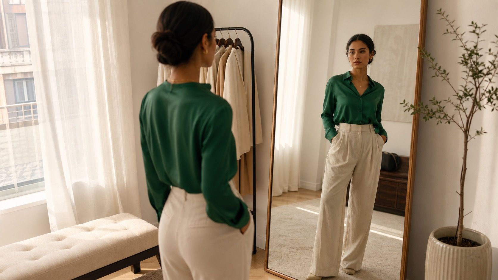
The quickest test happens near a window. Hold the colors close to your face, then take two steps back from the mirror. If one shade makes shadows under your eyes look deeper or gives your skin a gray cast, it may be a fine skirt but a poor scarf. Charts are better at suggesting candidates than at rescuing an unhelpful color.
Start with one neutral that earns its place
Most wearable outfits begin with a neutral anchor: navy jeans, charcoal trousers, ecru denim, chocolate boots, or a soft gray coat. Pick the neutral you already reach for, rather than the one fashion diagrams claim is universal. Black has a crisp edge, but it can overwhelm very low-contrast coloring. Cream is kinder on some faces, though it asks more of a commuter train and a tomato lunch.
Then add one color that has a clear role. A navy blazer with a pale blue shirt is restrained because the values are close. The same blazer with a rust sweater has more energy, yet the neutral keeps it from looking theatrical. If you begin with two bright pieces, the rest of the outfit has to work much harder.
| Neutral anchor | Easy color partners | Useful caution |
|---|---|---|
| Navy | sky blue, rust, soft pink, ivory | Very dark navy can read as black in evening light |
| Charcoal | burgundy, lavender, icy blue, white | Keep enough contrast if your hair is dark |
| Warm beige or camel | olive, coral, teal, chocolate | Choose the warmth that matches your skin, not the label |
| Ecru denim | red, sage, navy, faded blue | Check the shade in daylight; ivory and stark white behave differently |
Use three color relationships without making them precious
The first dependable route is analogous color: shades that sit near each other, such as blue, blue-green, and green. A denim shirt, deep teal trousers, and a gray sneaker can look put together without shouting. The trap is using every piece at the same depth. Give the eye a break with a light shirt, a dark trouser, or a quiet neutral.
Complementary colors sit opposite each other. Blue and orange, purple and yellow, red and green all have built-in tension. In clothes, the softer version usually wins: navy with cognac leather, plum with mustard earrings, forest green with a faded red lip. A bright orange sweatshirt against royal-blue trousers may be fun for someone who wants that effect, but it is not the only way to use the pair.
The third option is a near-neutral outfit with one accent. Think gray trousers, white T-shirt, black loafers, and a cranberry cardigan. This is the three-color rule at its most forgiving: two grounding colors and one clear note. It gives a chart a practical purpose because you can swap the accent without rebuilding the whole look.
Let proportion decide which color leads
Color does not take up equal space in a real outfit. A red coat is the story; a red belt is punctuation. Before buying a vivid piece, picture it at full size. Many people like cobalt in a nail polish, phone case, or scarf but feel swallowed by a cobalt dress. The color has not changed. Its proportion has.
A reliable split is roughly sixty percent neutral, thirty percent supporting color, and ten percent accent. It is not a law, and measuring yourself would be absurd. It is simply a way to diagnose why an outfit feels busy. If the trousers, shirt, shoes, bag, and jacket all announce separate colors, reduce one of them to a neutral or repeat a shade already present.
Placement matters too. A color near the face has more influence than the same color in a shoe. If warm tomato red makes your complexion look awake, try it as a tee, knit, or scarf. If it makes you look flushed, keep it lower down in a skirt, bag, or shoe and let a calmer neckline do the work.
Bring prints, denim, and texture into the chart
A print already contains a small clothing color chart. Pull one background color and one quieter detail from it; do not try to repeat every dot and stripe. A floral skirt with navy, cream, and terracotta usually needs a cream knit or navy jacket, not a terracotta bag, brick boot, and another floral scarf. The print is allowed to be the complicated piece.
Denim is often treated as a neutral, and most medium blue denim behaves that way. Pale washed jeans lean casual and cool; dark indigo looks sharper and can handle richer colors like burgundy or emerald. Black denim is less relaxed than blue, which is useful for an evening but can make a pale pastel top look a little severe.
Texture changes the perceived color. Matte olive cotton can look quiet beside beige; olive satin catches light and turns more noticeable. Chunky cream wool feels warmer than a smooth cream blouse. When two shades seem too close, texture can separate them without adding another color. That is often easier than buying a new accent.
Build a personal chart from the closet you already have
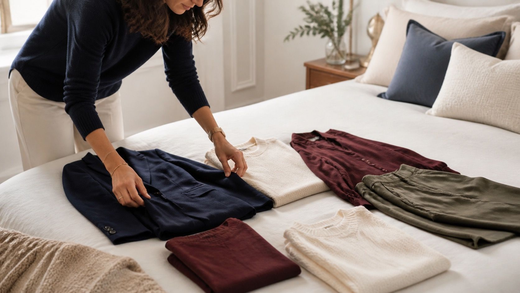
Lay out ten pieces you wear often: two bottoms, three tops, two layers, and three pairs of shoes or bags. Photograph them on a plain floor in daylight. You are looking for repeats, not a perfectly curated capsule. Perhaps navy appears in jeans, a blazer, and sneakers; perhaps soft white keeps returning because it works better on you than optic white.
Group the pieces into anchors, supporting colors, and accents. If you have six accents and no anchor, the problem is not that you need another bright scarf. You probably need trousers, shoes, or a jacket that makes those interesting pieces easier to use. A personal color chart should reveal such gaps without convincing you to replace an entire wardrobe.
Finally, make a small list of outfits that survived actual life: the one you wore to a long meeting, the one that worked in harsh fitting-room light, the one you reached for twice in a week. A chart becomes valuable when it remembers those wins. The color wheel can suggest the next combination, but your own closet supplies the evidence.