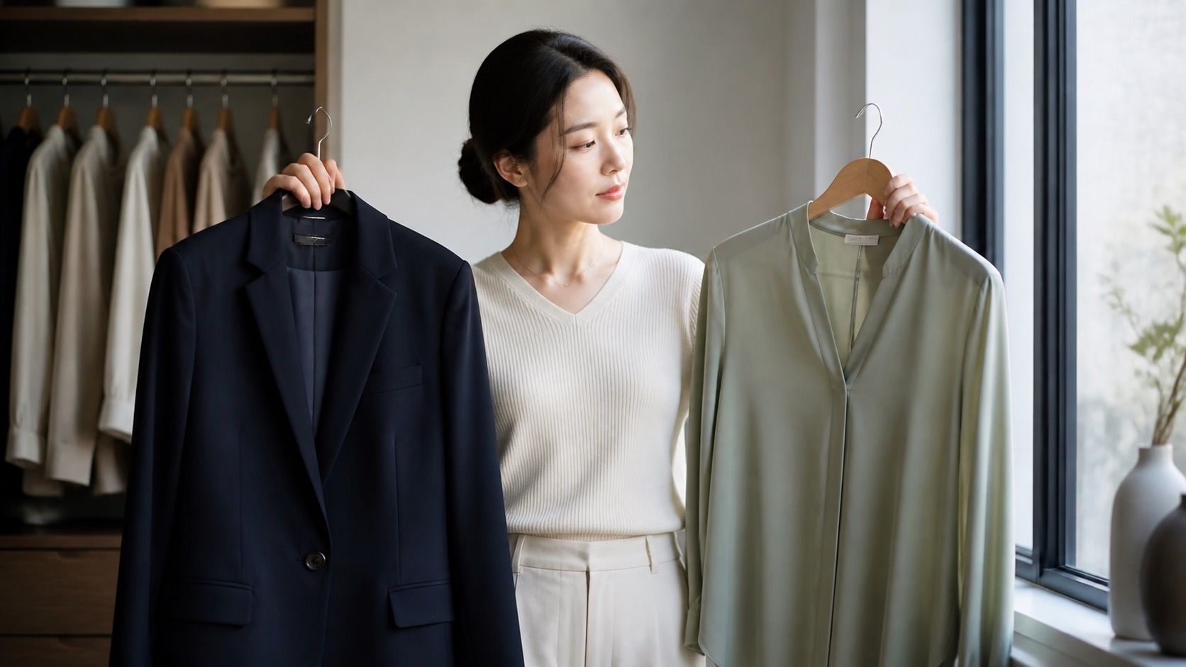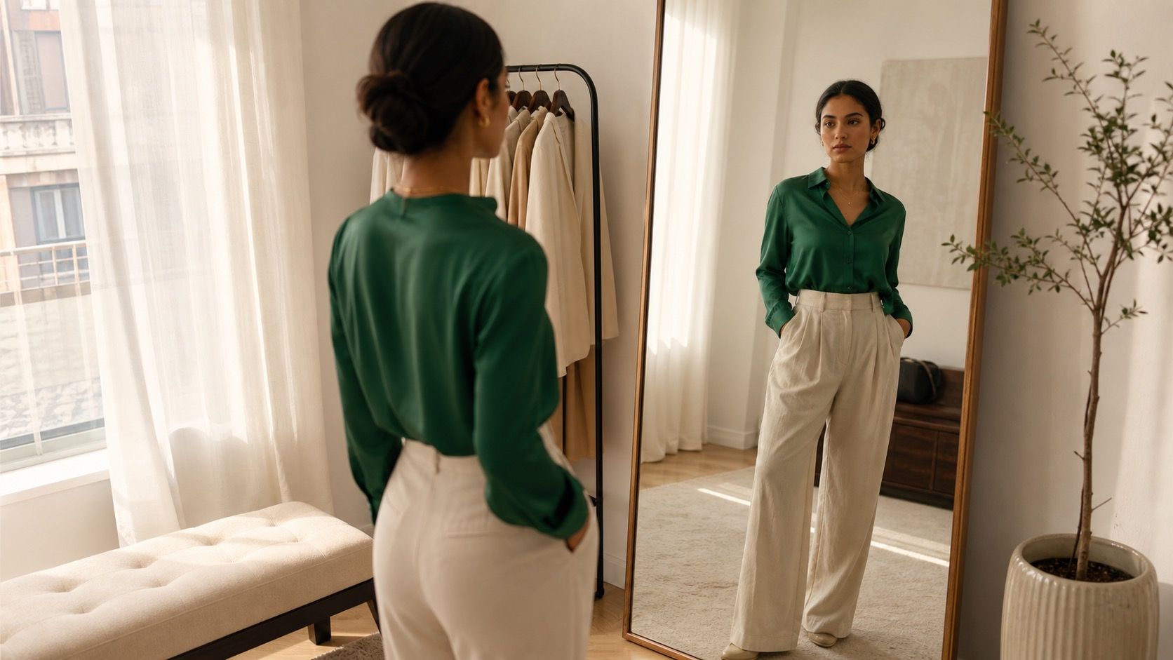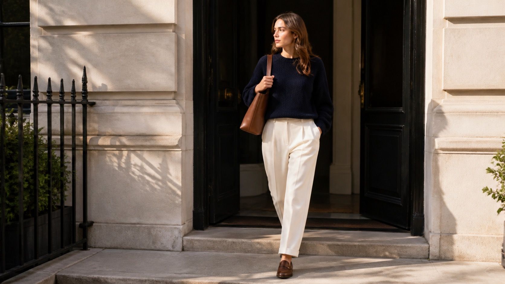
The best everyday outfit color combinations do not need a fresh idea every morning. They are the pairings you can make half awake, after checking the weather, and still feel like yourself in by lunchtime. A few dependable formulas are more useful than a saved folder full of dramatic looks that only work in perfect light and someone else's wardrobe.
Why repeatable combinations beat trend chasing
A color combination earns a place in your rotation when it survives ordinary conditions: the gray light at a bus stop, coffee splashed on a sleeve, an overheated office, and the moment you need a jacket after sunset. Trend colors can be fun, but they often arrive without the shoes, knitwear, and outerwear needed to make them practical. This is how a bright new top becomes a hanger resident after one outing.
Start with the colors already doing work in your closet. If most of your trousers are navy and denim, a cream, gray, burgundy, or soft blue top has more potential than a random citrus shade. If you wear brown leather shoes most days, olive, cream, pale blue, rust, and dark denim are easy companions. The formula should meet your real clothes rather than asking you to replace them.
Repetition is not a style failure. A navy-and-cream outfit can look different with straight jeans and trainers, cream trousers and loafers, or a navy blazer over a striped tee. The colors stay stable while texture, proportion, and weather do the changing. That is a calmer way to get dressed, especially when you want clothes to support the day rather than become the project.
Use a neutral plus accent formula on busy mornings
The simplest formula is two neutrals plus one accent. Think navy trousers, a soft white shirt, and a burgundy cardigan. Or black jeans, a charcoal sweater, and olive trainers. The accent does not need to be bright. A medium blue shirt against cream and brown counts. So does a plum scarf with gray and denim.
Give the accent a clear job. Keep it near the face when you want more energy, as with a sweater, shirt, or earrings. Put it on a bag or shoe when you prefer the outfit to read quietly. A red shoe with navy trousers is an easy lift; a red top, red bag, and red lip can be great for an event but is more effort than most Tuesday mornings require.
| Everyday formula | Example | Where it usually works |
|---|---|---|
| Dark neutral + light neutral + accent | Navy jeans, cream knit, burgundy bag | Office days, lunch, casual dinner |
| Two nearby neutrals + texture | Chocolate trousers, camel jumper, white trainers | Travel, errands, relaxed workwear |
| Denim + color + grounded shoe | Mid-blue jeans, forest green shirt, brown loafers | Weekends and informal meetings |
| Black + softened color | Black trousers, dusty pink knit, charcoal coat | Evening plans when pure contrast feels too sharp |
If you are unsure whether an accent is too much, reduce its area rather than abandoning it. A cobalt T-shirt under an open navy shirt is easier than a cobalt jacket. The same principle helps when testing outfit color ideas outside your usual range.
Build low-contrast combinations that still look considered
Low-contrast dressing uses colors that sit close together in lightness: cream with camel, charcoal with navy, olive with brown, pale blue with gray. These combinations can look polished without much planning, but they need one small point of separation. Without it, a beige sweater and beige trousers can drift into sleepwear territory.
Texture is the easiest fix. Combine denim with a fine knit, leather with cotton, or a ribbed top with smooth trousers. A dark brown belt on cream trousers gives the outfit a boundary. So does a navy sock with a brown loafer. You do not need every item to announce itself; you just need the pieces not to blur into one flat block.
Navy and cream is a dependable low-contrast-ish pairing for many people because it has enough difference to look intentional without the hard edge of black and white. The shade of cream matters. Soft white works well with cool navy; a more yellow cream often feels better with warmer brown leather. Check this near your face, not only on a shopping website where every white looks identical.
Use high contrast with proportion, not more colors
Black and white, navy and optic white, chocolate and pale blue, or burgundy and light gray can look clean because the difference is obvious. The trap is adding several more strong colors to prove that the outfit has personality. High contrast already has a point of view. Let one pair do the work.
Proportion controls the intensity. A black coat over a white tee and black jeans is a large, graphic block. That can be excellent if your hair, brows, or features have similar contrast. If it feels severe, keep black in the trousers or shoes and use charcoal, denim, or soft white closer to the face. The same outfit suddenly has more room to breathe.
Gray and burgundy are useful when black and red feel too dramatic. A charcoal trouser, heather-gray knit, and burgundy shoe or bag has depth without looking theatrical. For a slightly stronger version, wear the burgundy knit and keep the coat gray. The change is small, but it shifts the focus toward the face.
Match shoes and bags without overmatching them
Shoes and bags do not have to be twins. In fact, exact matching can make an everyday outfit look dated or overplanned. It is enough that they share a temperature, depth, or texture. A medium-brown bag can sit happily with dark-brown boots; a black crossbody can work with charcoal trainers; a navy bag can connect to dark denim without copying the shoe.
Use shoes as an anchor when the clothes are pale or colorful. Olive trousers, a cream T-shirt, and brown shoes feel grounded because the brown appears as a clear dark note. With black shoes, the same outfit can work, but a black belt or bag helps repeat the color. One repeat is enough. Three repeats often make the outfit feel diagrammed.
White trainers deserve their own check. Bright white has a sporty, high-contrast effect, especially with dark trousers. Ecru, cream, or light gray trainers blend more easily into warm neutrals and softer palettes. If your wardrobe contains lots of beige, olive, and denim, an off-white trainer may be more useful than the crispiest white pair in the shop.
Make the formulas work with your own palette and season
Clothing color combinations do not live apart from skin tone, hair color, or the season you are dressing through. If navy and cream is a good formula but cream makes you look washed out, move cream to trousers and put a clearer blue, berry, or green near your face. If black and olive feels heavy in summer, swap black for charcoal, soft navy, or warm gray.
Seasonal layers change the balance. A camel trench is a large warm field over a cool blue shirt; a navy coat cools down a rust jumper; a black puffer gives even pale pink a firmer outline. Lay outerwear over the outfit before deciding the colors are finished. In cold weather, the coat is often the most visible part of the look.
Keep a short note on your phone with four or five combinations that reliably work for you. Mine would be less glamorous than a color theory chart: navy and cream, brown and blue, gray and burgundy, olive and black. That is the point. Good everyday outfit color combinations should be easy to remember, easy to repeat, and flexible enough to survive the clothes you already own.