If you keep asking what color clothes look best on me, you do not need a dramatic makeover or a rigid color type. You need a repeatable way to compare a few fabrics close to your face. The most useful colors make the skin look more even and the features easier to see; the less useful ones can be fashionable, but they ask for more makeup, a tan, or the right lighting to work.
What you are really trying to see
Color is not only about whether you like blue, red, or green. Near the face, a garment changes the way skin tone, under-eye shadows, teeth, hair, and eye color are perceived. A good shade usually lets people notice you first and the shirt second. A poor shade may make your face look dull, blotchy, or strangely yellow even when the item itself is attractive. This is why a color that looks great on a friend can feel wrong on you without either person being dressed badly.
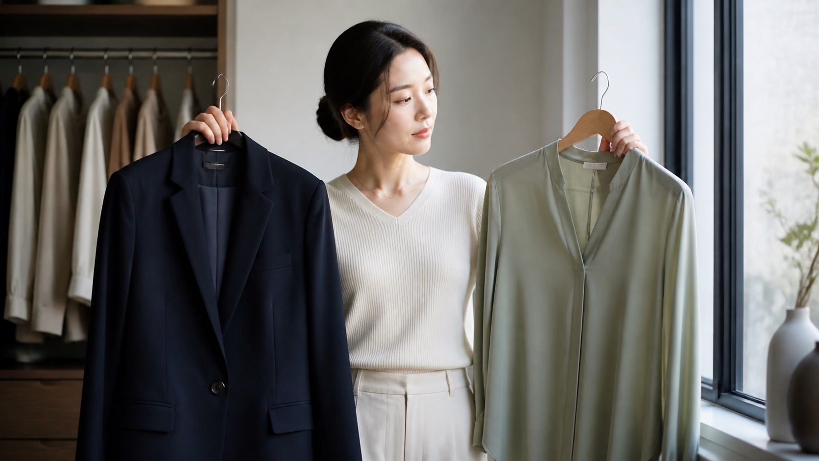
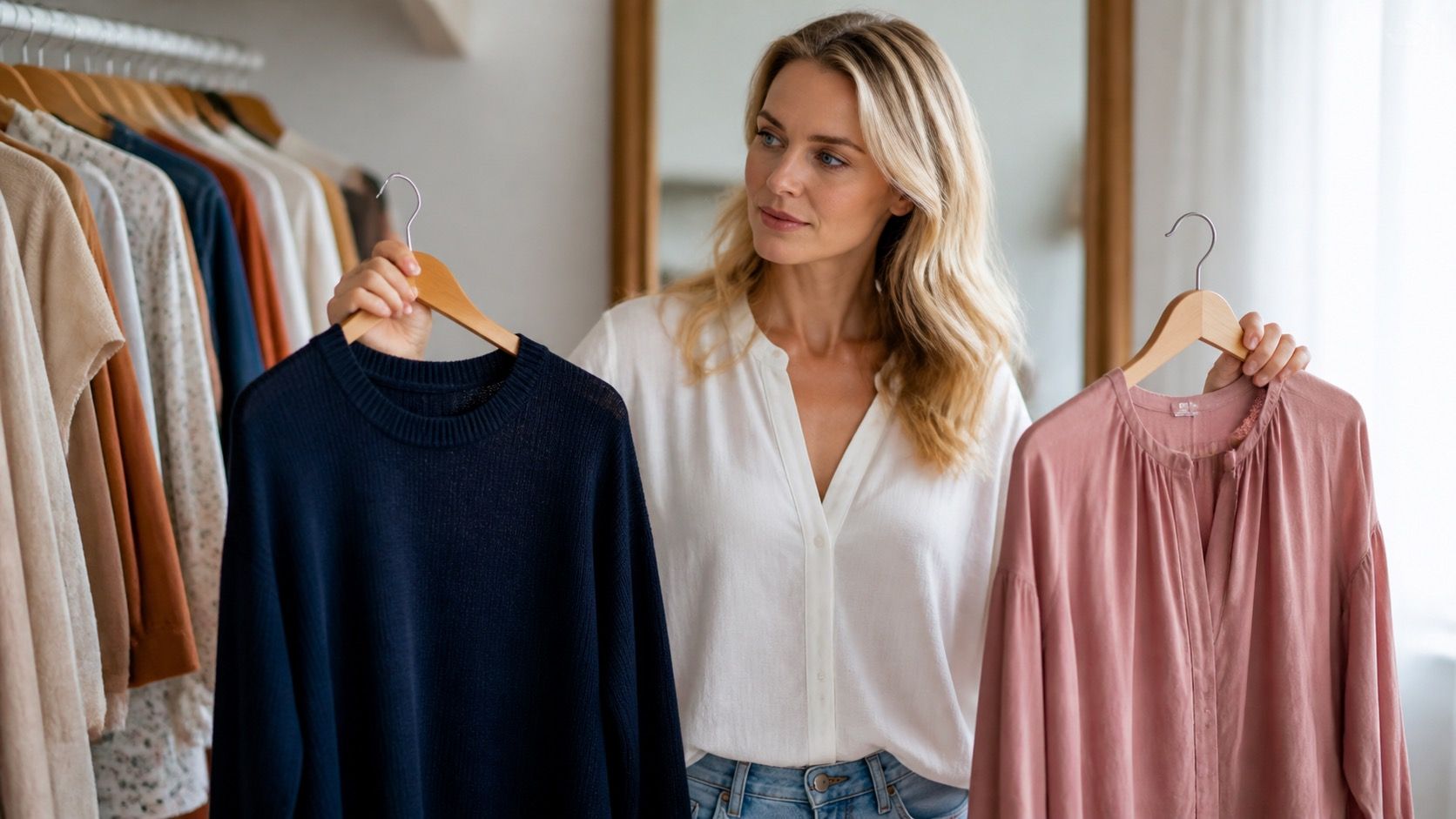
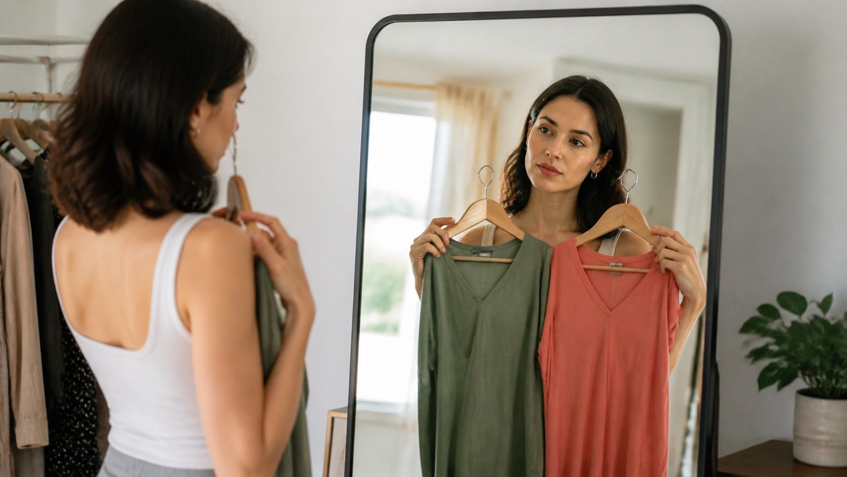
Keep the test simple. Use two or three tops or scarves in clearly different directions: crisp white and cream, navy and black, dusty rose and bright coral, charcoal and camel. Stand by a window in daytime, with hair pulled back if possible. Look at the area around the eyes and mouth rather than staring at the garment. You are not trying to identify an exact named season. You are collecting evidence about light versus dark, warm versus cool, and muted versus saturated color.
Test undertone without turning it into a science project
Start with white versus cream. Put each fabric under your chin, one at a time. If pure white makes the face look clearer and cream looks yellow, you may lean cool. If cream gives the skin a rested, smooth look and stark white seems severe, you may lean warm. If both are workable, you may have a neutral undertone or simply need to consider contrast next. The point is not to win an argument about undertone; it is to find a useful direction for shopping.
Then compare two reds or two blues. Blue-red, berry, navy, and slate usually lean cooler. Tomato, coral, warm teal, and rust lean warmer. If you have a warm-leaning complexion, a heavily icy lavender may make your skin seem grey; if you lean cool, orange-red can look disconnected from the face. Take one unfiltered phone photo in the same window for each option. A photo is a backup, not the final judge, since cameras change white balance, but it can reveal a difference you missed in the mirror.
Use hair and eyes as clues about contrast
Hair color and eye color do not dictate a palette, but they do change how much contrast an outfit can carry. Very dark hair with fair skin often supports clearer contrast: black, ink navy, jewel tones, and clean white can look sharp. Soft brown or blonde hair with light skin may be more comfortable in medium-depth colors such as denim blue, mushroom, muted berry, sage, or soft navy. The aim is not to copy the eye color; it is to give your face enough definition without letting the clothing overwhelm it.
Try the squint test from a couple of metres away. If a pale beige top makes your hair, skin, and features blend into one quiet blur, the outfit probably needs more depth. If a black turtleneck arrives in the room before you do, reduce the contrast with an open neckline, earrings, or a lighter jacket. Eye color can guide an accent: navy and smoky blue often sharpen blue or grey eyes, while aubergine, forest, and warm rust can bring out the complexity in hazel and brown eyes without being literal matches.
Compare colors in daylight, not only in the fitting room
Store lighting is designed to sell clothes, not to give an honest answer. Warm bulbs can make camel, cream, and coral glow; cool lights can make icy colors look cleaner than they will outdoors. If you can, walk to a window or step outside with the garment. Compare it against one item you already know works. Even better, try it with the jeans, coat, or shoes you will actually wear. A color may suit your skin but still fight the rest of your wardrobe.
Fabric changes the result as much as the dye name. Matte cotton, linen, and wool absorb light and often soften a strong shade. Satin, polyester, and ribbed knits reflect more color upward onto the face. A bright red matte tee can be easy to wear, while the same red in shiny satin can feel louder and more demanding. When you test what colours suit you, make a note of both the shade and the fabric. It saves you from buying a second version that somehow does not give the same effect.
| Comparison | A useful result looks like | If it does not work |
|---|---|---|
| White versus cream | Skin appears smoother and more even | Use the other neutral or move it away from the face |
| Navy versus black | Features stay defined without harsh shadows | Choose navy, charcoal, or an open neckline |
| Muted versus bright color | The color supports rather than dominates the face | Reduce saturation or use the bright shade below the waist |
| Light versus dark top | Hair, skin, and clothing have clear separation | Add depth with a jacket, scarf, or darker base |
Turn the result into clothes you can actually wear
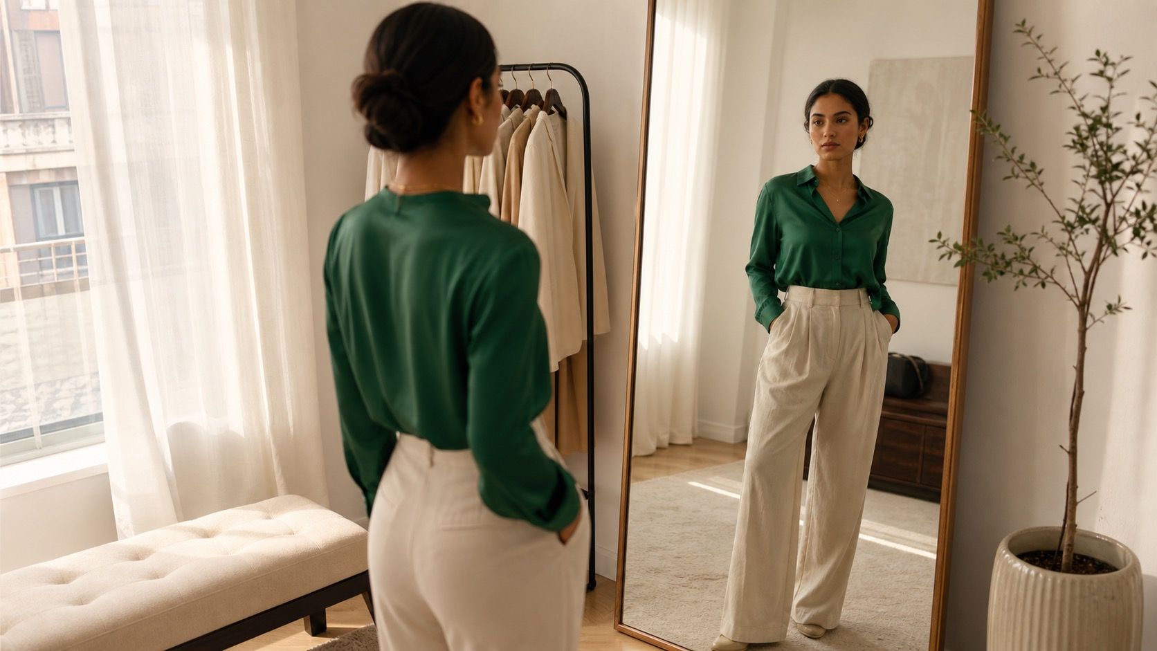
Once you see a pattern, build a personal palette rather than hunting for a single magic color. Choose three neutrals that work near the face, two darker colors for trousers and outer layers, and three accents you enjoy wearing. For example, a soft, cool direction might include soft white, charcoal, navy, denim, dusty rose, plum, and blue-green. A warm direction could include cream, dark brown, warm navy, olive, rust, teal, and muted coral. Neutral coloring can often borrow a little from both, especially when the shades are not extreme.
Make outfits by using one neutral as the base and one accent near the face. A navy cardigan over a soft white tee, mushroom trousers with a muted berry knit, or cream with dark teal are easier to repeat than a closet of unrelated colors. Save a small album of mirror photos of successful combinations. After a month, the pictures will show more than memory does: which shade works without makeup, which one needs a particular haircut, and which colors only looked good on a sunny afternoon.
Avoid the traps that make color testing confusing
Do not test ten colors at once. Your eyes adapt quickly, and after a pile of scarves everything starts to look plausible. Compare one pair, decide which one is clearer, then move on. Avoid testing just after self-tanner, a dramatic lipstick, or a day in strong sun, because these temporarily change the contrast you are judging. The same caution applies to social-media filters. They smooth skin and alter white balance, precisely the details you are trying to notice.
Do not treat a color system as an instruction to throw away half your wardrobe. A shade can be less ideal near the face and still work as trousers, a skirt, a coat lining, shoes, or a bag. If you love a difficult color, pair it with one of your reliable neutrals and check the neckline. The answer to what color clothes suit me should make getting dressed simpler, not turn every purchase into a pass-or-fail test. Keep the colors that give you energy and use the mirror to refine the way you wear them.